10 benefits of unified communication dashboards
Discover how unified communication dashboards enhance decision-making, boost productivity, and improve customer experience—all in one place.

Unified communication dashboards give decision-makers one screen that ties call quality, chat volume, licence spend and customer wait times to the outcomes leadership actually cares about: faster decisions, lower cost, and happier customers. Organisations in the top quartile of dashboard usage outperform bottom-quartile peers across multiple performance measures, according to MIT CISR, because unified metrics let teams spot a problem and act on it in the same week rather than the same quarter.
The main payoff shows up in five areas:
- Productivity and collaboration — less app-switching, faster response times
- Cost and licence optimisation — cutting unused SaaS seats and telecom waste
- Customer experience — fewer dropped calls, faster resolution
- IT efficiency — shorter mean time to resolution (MTTR) on faults
- Security and compliance — early warning on suspicious activity
Don’t try to build the perfect dashboard on day one. Start with a proof-of-value dashboard tracking three to five outcome KPIs, prove it changes a decision, then expand.
Key Takeaways
Unified communication dashboards work because they translate technical performance data into the business language of cost, productivity and customer experience, giving decision-makers the evidence to act faster.
| Point | Details |
|---|---|
| Start small, prove value | Launch a pilot dashboard tracking three to five outcome KPIs before expanding enterprise-wide. |
| Layer for different audiences | Build executive, manager and operational views so nobody drowns in irrelevant detail. |
| Prioritise drill-down | Every KPI tile should click through to the root cause, turning alerts into fixes. |
| Track adoption, not just uptime | A widening gap between daily and monthly active users signals training has gone stale. |
| Consider Australia-hosted platforms | Conversational AI feeds multichannel telemetry and real-time analytics into dashboards while keeping data within Australia for compliance. |
Table of Contents
- Benefits of unified communication dashboards, ranked by business impact
- Which KPIs and metrics should a UC dashboard track?
- What the evidence says about dashboard-driven outcomes
- How do you design a dashboard that works for executives and technicians alike?
- Rolling out a dashboard without the usual delays
- What does it cost, and when do you see ROI?
- Choosing the right platform or observability solution
- A local option that plugs straight into your dashboard strategy
- Frequently asked questions
- Sources
Benefits of unified communication dashboards, ranked by business impact
Each of these ten benefits solves a specific, recurring problem for IT managers and the executives they report to. Some are about speed, some about cost, and a few are about risk you don’t see until it’s too late.
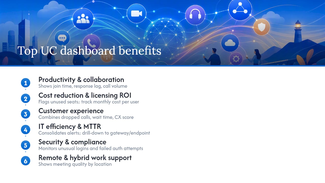
1. Improved productivity and collaboration
A dashboard that shows meeting join times, chat response lag and call volume in one view stops teams guessing why a project stalled. When a regional sales team’s average call handling time creeps up, a manager sees it inside the dashboard instead of hearing about it three weeks later in a complaint email. Watch join time and first-response time as your leading indicators.
2. Cost reduction and ROI on licensing and telecom
Domo notes that interactive KPI dashboards cut reliance on manual spreadsheets, which is exactly where licence waste hides. A dashboard that flags 200 unused Teams or Zoom seats pays for itself in the first billing cycle. Track cost per active user monthly, not annually, because seat creep happens fast in growing teams.
3. Improved customer experience and service quality
Dropped call rate, average wait time and first-contact resolution roll up into a single customer experience score that shows whether service is improving or sliding. A contact centre that ties this score to staffing decisions can shift rosters before a queue backs up, not after. AI live chat integration telemetry feeds directly into this view for teams running chat alongside voice.
4. IT efficiency and reduced MTTR
Consolidating alerts from multiple UC portals into a single pane of glass cuts the time technicians spend toggling between systems, according to VOSS Solutions, and that translates directly into faster mean time to resolution. A drill-down from “call quality degraded” straight to the specific gateway or endpoint saves an engineer from a manual audit. IT teams automating support workflows often pair this with an AI-driven helpdesk to close simple tickets before they hit the queue.
5. Security and compliance monitoring
A dashboard tracking unusual login patterns, off-hours access and failed authentication attempts gives security teams a live view instead of a monthly audit. For regulated sectors, this is often the difference between catching an anomaly in hours versus discovering it in a compliance review months later. Set an alert threshold on spikes in failed logins, not just absolute counts.
6. Support for remote and hybrid work
Microsoft’s guidance on unified communications points out that centralising tools into one view reduces the friction of switching between apps, which matters most when your workforce is split across home offices and branch sites. A dashboard showing meeting quality by location can reveal that one branch’s network consistently drags down call clarity, a fix that’s invisible without the data.
Pro Tip: Segment your experience metrics by location and device type before you segment by team. A single bad Wi‑Fi router at one site can skew an entire department’s numbers and send you chasing the wrong fix.
7. Automation and AI integration opportunities
Unified communications analytics increasingly uses machine learning to surface trends and predict maintenance needs before they cause outages. Dashboards that ingest telemetry from AI agents handling voice, SMS and email calls give IT visibility into how much volume automation is actually absorbing, which is the real measure of whether an AI communication rollout is working.
8. Licence and SaaS spend optimisation
Beyond raw cost cutting, a dashboard that tracks feature adoption per licence tier tells you whether you’re paying for capability nobody uses. A finding a lot of IT managers overlook: seat count rarely matches active usage, and the gap widens every quarter without active monitoring.
9. User adoption and training benefits
Self-service, multi-audience dashboards increase stakeholder engagement because executives get a high-level view while operational staff drill into the detail that matters to their day, a pattern documented in dashboard design research covering the Toyota Motor Europe rollout. Track daily active users against monthly active users; a widening gap is your earliest sign that training has gone stale.
10. Operational scalability
A dashboard architecture that scales from one site to fifty without redesign saves months of rework as a business grows. Building on tools that support layered data models from the outset, rather than a flat spreadsheet export, means adding a new region is a configuration change, not a rebuild.
Which KPIs and metrics should a UC dashboard track?
Not every metric deserves a spot on the dashboard. The ones below map directly to a business decision, which is the only test that matters.
Experience metrics
- Meeting quality score — composite of audio/video clarity; alert below 90% good-quality sessions
- Join time — seconds from click to connect; alert above 15 seconds
- Call/meeting drop rate — percentage of sessions ending unexpectedly; alert above 2%
Operational metrics
- Mean time to resolution (MTTR) — average hours to close an incident; alert if trending upward over three periods
- Incident count by category — volume of network, endpoint or licensing faults; watch for repeat categories
Financial metrics
- Cost per active user — total UC spend divided by monthly active users; review at seat renewal
- Licence utilisation rate — percentage of purchased seats actively used; alert below 70%
Adoption metrics
- DAU/MAU ratio — daily to monthly active user ratio; a falling ratio signals disengagement
- Feature adoption rate — percentage using AI, transcription or automation features beyond basic calling
Security metrics
- Suspicious activity count — failed logins, off-hours access attempts; alert on any spike over baseline
These figures come from a mix of call detail records, endpoint telemetry, meeting platform logs, and licence management reports. A performance management dashboard pulling MOS scores, packet loss and jitter from endpoint telemetry gives IT the technical layer, while licence reports and CRM exports supply the financial and adoption layers.
What the evidence says about dashboard-driven outcomes
The MIT CISR finding isn’t a marginal edge. Organisations in the top quartile of dashboard usage significantly outperformed bottom-quartile companies across multiple internal and external performance measures, and the mechanism is straightforward: unified metrics let a company make course corrections at the speed of the data, not the speed of the next quarterly meeting.
Toyota Motor Europe rebuilt its dashboard architecture into three layers, executive, regional and operational, and cut decision cycles from five days down to same-day responses. The transformation, which combined Power BI dashboards with Excel-based data preparation and KNIME automation, also drove a 40% improvement in pivot speed, a 65% increase in regional manager engagement, and an 18% market share gain in a single quarter, according to a detailed case analysis.
That case matters because it shows the layering effect: executives got a summary view, regional managers got market-specific detail, and operational teams got the granular data to act on immediately. No single dashboard tried to be everything to everyone.
The broader shift in UC monitoring reinforces this. UC observability research from TechTarget describes a move away from raw infrastructure metrics, jitter, packet loss, latency, toward correlating those signals with user experience and financial ROI.
Pro Tip: Build drill-down into every KPI tile from day one. An alert that says “call quality degraded” is useless without a click-through to the specific gateway, region or time window causing it. Drill-down turns a dashboard from a warning light into a diagnostic tool.
How do you design a dashboard that works for executives and technicians alike?
The single biggest design failure in UC dashboards is building one view and expecting it to satisfy an executive, a regional manager and a network engineer equally. It won’t. Each of those audiences needs a different altitude of detail.
- Build in three layers: an executive summary (five KPIs, trend arrows, no jargon), a manager view (regional or departmental breakdowns), and an operational view (raw technical metrics with full drill-down)
- Design for mobile first — executives check dashboards on phones between meetings, so the top layer must render cleanly on a small screen
- Add accessibility basics: colour-blind-safe palettes, text alternatives for charts, keyboard navigation
- Build in self-service safeguards — let managers filter and slice data without giving them the ability to edit source calculations
- Keep the data pipeline separated from the visual layer, so a change to one doesn’t break the other
A practical architecture pairs ingestion tools with visualisation and validation layers. Data comes in from call detail records, meeting platforms and licence systems; Microsoft Excel, using Power Query and PivotTables, is often the fastest way to clean and validate that raw data before it hits a reporting layer. KNIME handles more complex transformation and blending when data sources multiply, and Power BI turns the validated output into the interactive, drill-down visuals both executives and technicians rely on.
Pro Tip: *Don’t wait for a perfect dataset before launching. Ship a rough first version, build a feedback button directly into the dashboard, and let real usage tell you which metrics matter.
Rolling out a dashboard without the usual delays
Most UC dashboard projects stall for the same handful of reasons, and nearly all of them are avoidable with a bit of upfront discipline.
Checklist before you build anything:
- Define the business decisions the dashboard needs to support, not just the metrics you happen to have
- Set data contracts with each source system so field names and formats stay consistent
- Choose no more than five to seven KPIs for the first version
- Build a pilot with one team or region before rolling out enterprise-wide
- Validate data quality against a manual sample before trusting the automated feed
- Roll out and track adoption, not just uptime
Common pitfalls to avoid:
- Pulling data from siloed systems that never get reconciled against each other
- Leaving dashboard ownership unassigned, so nobody maintains it after launch
- Trying to measure everything instead of the handful of metrics tied to real decisions
- Treating launch as the finish line and neglecting ongoing governance
A realistic timeline runs a pilot over four to six weeks with one team, expands to a full department by month three, and reaches enterprise rollout with formal governance by month six. Assign an owner at each stage, someone accountable for data quality, not just dashboard design, and check that person doesn’t change halfway through the rollout.
What does it cost, and when do you see ROI?
Budget for six categories: tooling and licensing, integration work to connect data sources, data engineering to clean and structure feeds, visualisation licences (Power BI seats, for instance), change management to drive adoption, and ongoing maintenance once the dashboard is live.
A simple ROI formula works for most first pilots: (value of decisions improved + cost savings identified) minus (total build and running cost) = net return. As a conservative example, if a dashboard surfaces $40,000 in unused licences and shaves two days off a recurring decision cycle worth an estimated $15,000 in lost productivity per delay, against a $25,000 build and first-year running cost, the pilot clears $30,000 in net value inside twelve months.
Expect a working pilot within one to three months. Measurable ROI, the kind you can put in a board report, typically takes six to twelve months. Interactive KPI dashboards that replace manual spreadsheet reporting tend to hit that ROI window faster, according to Domo’s research on dashboard adoption, because the time savings from ditching manual reports show up almost immediately. What slows the timeline down is usually data quality, not technology. Messy source data adds months before a single number can be trusted.
Choosing the right platform or observability solution
Selecting a dashboard tool starts with the outcomes and KPIs you defined earlier, not a feature comparison spreadsheet. Ask any vendor these questions before signing anything:
- Can it ingest data from multiple UC vendors without custom middleware for each one?
- Does it support genuine drill-down, from a summary KPI to the raw record behind it?
- Can it combine technical metrics (jitter, MOS scores) with financial metrics (cost per user) in the same view?
- Can it host in a private cloud, or meet data sovereignty requirements for your industry?
- Does it export compliance and governance reports in a format your auditors accept?
| Evaluation Criteria | Why It Matters |
|---|---|
| Multi-vendor data ingestion | Avoids blind spots when your UC stack spans more than one provider |
| True drill-down capability | Converts high-level alerts into specific, actionable root causes |
| Combined technical + financial view | Lets IT justify budget requests with business language, not just network jargon |
| Private cloud / data sovereignty | Critical for healthcare, finance and other regulated sectors |
| Governance and audit export | Saves manual compliance reporting work every quarter |
Watch for red flags: opaque calculations you can’t audit, limited or absent drill-down, telemetry locked to a single vendor with no export path, and no built-in way for users to flag problems or request new views. A dashboard that can’t evolve with feedback becomes shelfware within a year.
Why local, private-cloud analytics changes the calculus
Regulated industries can’t treat data sovereignty as an afterthought once a dashboard is already collecting sensitive call records and customer conversations. Hosting analytics within Australia, rather than routing telemetry through offshore servers, keeps compliance simple and latency low for real-time reporting. That’s exactly why this approach suits healthcare providers, financial services firms and other privacy-sensitive sectors handling patient or client data daily. Multichannel AI agent telemetry, real-time analytics and CRM-linked reporting only deliver full value when the underlying platform respects the same data boundaries your compliance team already enforces.
A local option that plugs straight into your dashboard strategy
Conversational AI is the alternative to piecing together offshore analytics tools and disconnected channel platforms; every conversation, whether voice, SMS, email or live chat, gets logged and reported from infrastructure hosted entirely within Australia.

The platform’s real-time analytics feed directly into the kind of unified view this article has been describing: multichannel agent telemetry, CRM integration, and automated follow-up tracking, all reporting from one Australian-hosted environment rather than a patchwork of overseas dashboards. For IT managers building the KPI layers covered earlier, that means feature adoption, customer experience scores and cost-per-interaction data arrive already structured for a dashboard, not buried in five separate exports. Healthcare, finance and professional services teams get the data sovereignty guarantees their compliance frameworks demand, without sacrificing the drill-down detail operational teams need. If you’re weighing up how to feed a UC dashboard with clean, compliant, multichannel data, book a look at the platform and see how the reporting layer maps to the KPIs you’ve already defined.
Frequently asked questions
What are the main benefits of unified communication dashboards?
The core benefits of unified communication dashboards are faster decision-making, lower licensing and telecom costs, improved customer experience, reduced IT resolution times, and stronger security and compliance visibility, all driven by consolidating data from multiple channels into one view.
How do communication dashboards improve business decisions?
Dashboards improve decisions by correlating technical performance data, such as call quality or network latency, with business outcomes like customer satisfaction and cost per user, letting leaders act on evidence rather than anecdote. Toyota Motor Europe’s rollout cut decision cycles from five days to same-day using this exact approach.
Which metrics matter most on a UC dashboard?
Prioritise mean time to resolution, cost per active user, licence utilisation rate, meeting quality score, and the ratio of daily to monthly active users. These five map most directly to the decisions executives and IT managers actually need to make.
How long does it take to see ROI from a UC dashboard?
A working pilot typically takes one to three months, while measurable ROI you can present to a board usually takes six to twelve months, depending on data quality and how quickly your teams adopt the new reporting.
Can small IT teams build a UC dashboard without enterprise tools?
Yes. Many teams start with Microsoft Excel’s Power Query and PivotTables to validate data, then layer in Power BI for visualisation and KNIME for more complex data blending as the dashboard scales beyond a single pilot.
Sources
- MIT CISR — dashboarding and organisational performance
- The insights and benefits of unified communications analytics (TechTarget)
- Dashboard design and interactive communication (chapter)
- The advantages of an effective KPI dashboard (Domo)
- The secret to better IT decisions? Intuitive dashboards (VOSS Solutions)